
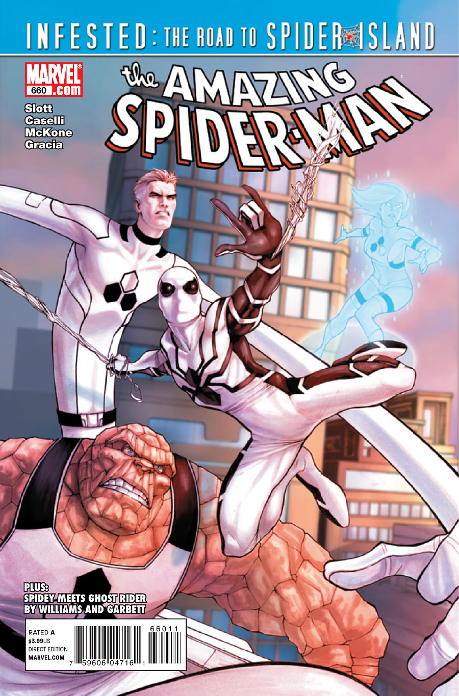
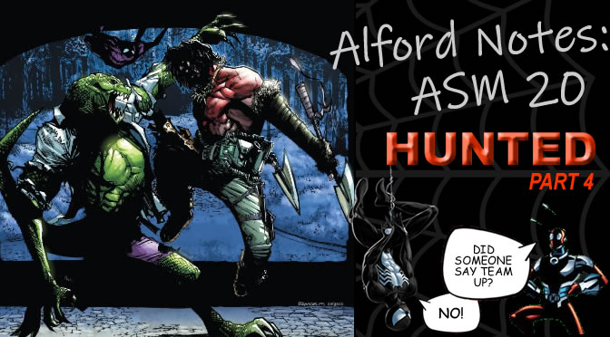
 The Future Foundation battles the Sinister Six on a Caribbean island, unaware that Doctor Octopus has a more sinister plan brewing in the shadows. PLUS! The Jackal, Ghost Rider and the secret behind Carlie Cooper’s tattoo!
“Fantastic Voyage” part 2 of 2
Story by Dan Slott and Fred Van Lente
Illustrated my Mike McKone and Stefano Caselli
Colored by Marte Garcia
Lettered by VC’S Joe Caramagna
Cover Art by Stefano Caselli and Lorenzo De Felici
“Infested Stage 2: GREAT POWER”
Story by Dan Slott
Illustrasted by Lee Garbett
Inked by Scott Hanna
Colored by Edgar Delgado
Leterred by VC’s Joe Carmagna
“Can’t Get the Service” part 3
Written by Rob Williams
Illustrated by Lee Garbett
Inked by Alejandro Sicat
Colored by Fabio D’aUria
Lettered by VC’s Joe Carmagna
Assistant Editor: Ellie Pyle
Senior Editor: Stephen Wacker
Editor in Chief: Axel Alonso
Chief Creative Officer: Joe Quesada
Publisher: Dan Buckley
Executive Producer: Alan Fine
THE PLOT(s): The Future Foundation does battle with Sandman, Electro, Chameleon and the Rhino in the Caribbean. Jackal is committing acts of SCIENCE!!! against a hapless high school student. Ghost Rider and Spider-Man attempt to take down the Servicer who has inhabited Ghost Rider’s motorcycle.
LONG STORIES SHORT: The FF realize that the members of the Six they were fighting were robots and holograms induced by Mysterio. Spider-Man saves the junior members of the FF’s lives at the small expense of letting Mysterio and Chameleon escape. Peter goes home to an upset Carlie, who after some sweet talk reveals that she got a tattoo of Spider-Man on her lower waist. Ghost Rider and Spidey prevail over the Servicer.
MY THOUGHTS: Before I start, I would like to wish the previous reviewer Gerard DeLatour II the utmost best of luck in his future endeavors. For the past straight year, Gerard provided the website with his unique brand of humor, remarkable eye for artistic detail, and unique perspective on the title of Amazing Spider-Man. He left shoes way too big to fill for this job, and we all wish him the best.
Diving right into this beast, the first thing you notice is that Mike McKone does the bulk of the art chores for the main story. That’s the third artist for this story in three issues, with Javier Pulido on #658 and Stefano Caselli for the last issue. One wonders what’s up with the constant artist change mid issue, because it’s been a consistent factor in this title since Brand New Day started. It’s something that I don’t tend to see in most other books, and when it is done it’s either for the sake of a dream sequence meant to capture the kooky effects, or for a celebration of a title or run such as in Batman and Robin #16. It’s just a very odd thing to me to see two completely different styles in the same story for seemingly no reason, especially since I don’t tend to find that apparent in other Marvel titles. If it does happen a lot, then the joke’s on me. But the immediate thought in my mind is that the title isn’t being taken very seriously if the book isn’t given a consistent main artist for more than an issue. Maybe Pulido and Caselli both ate at the same restaurant and got food poisoning, who knows.
That said, the art is very solid throughout by both McKone and Caselli. Mike McKone has always been an interesting artist to see develop over the past few years, and in this issue his art seems to have evolved since the Black Cat re-introductory arc, while still being very good. His action scenes are very good, and all the models continue to be fluid and natural as he’s always made them. One thing I don’t care for about his art is that his faces tend to look very muted during high-stress situations. There’s a couple of shots of Valeria and Reed which look like they can barely keep their eyes open. It’s not as frequent as I’ve found it in the past, so it’s a minor issue. It is the one thing I’ve never liked about his art though, but that’s about it for nitpicks where art is concerned.
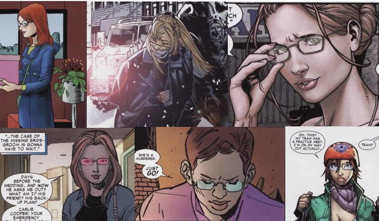
Caselli on the other hand leans more towards my kind of artist, in that his faces and anatomy are all very expressive while still being realistic. Admittedly, Peter’s face does get pretty cartoony at the bottom of the second to last page of the main story, but that falls back on how you take your art. Some people might not mind, others mind. As long as it doesn’t go into out-and-out Looney Tunes, I’m okay with it. One thing that is kind of annoying is how utterly inconsistent Carlie’s overall design has become. Not comparing to the last issue because it’s the same artist, but in reading past issues and message board posts (With special thanks to stillanerd for the upcoming image) there’s no way it’s the same girl. When she first appeared she had reddish hair. In this issue she has blondish hair. Sometimes she has freckles, sometimes she doesn’t. Sometimes she had short hair, sometimes she doesn’t. It’s getting to be really ridiculous on a month-to-month basis, with the worst offender being the transition between “Origin of the Species” and “Big Time” where her hair length literally went from Glory Grant size to Mary Jane Watson size. Again, not completely Caselli’s fault but this woman NEEDS some consistency now.
Storywise, this is a fighting issue. Nothing inherently wrong with that, but from the opening page there was a distinct disconnect that I felt from reading which I wasn’t able to really pinpoint until the second read-through. I’m going to get this out of the way now so I won’t be repeating myself on future reviews.
There is a LOT of clunky dialogue thrown at the reader from the get go, and it really threatens to kill the issue. And I’m not just talking about plot exposition to help out readers who may have missed the last issue (although you can find that here as well). Really the writing of the characters’ individual voices is what struck out at me, ringing very forced and…I dunno…”broadcasted” if that makes any sense. For example, the opening double page spread of the FF and the SS consists of the following dialogue:
The Thing: “You ain’t knocking over the First National Bank of Yancy Street No More, Ya Bums! The is the FUTURE FOUNDATION you’re messin’ with! SO IT’S CLOBBERIN’ TIME!”
Spider-Man: “Careful Ben! The SINISTER SIX aren’t pushovers–believe me, I know! Terrible dressers? Yes! Intermittent deodorant users? Double Yes! But pushovers? NOT!”
Electro: “Listen to the Albino Bug, Rock Man. Leave this island–or lose your life!”
Now I know the comic book industry’s mantra of “Every issue is somebody’s first.” That being said, the dialogue in that double splash, and much of it in the issue comes off very redundant and artificial, as if the character’s suddenly regained consciousness after being asleep in between issues. It’s been seconds in comic time since the last issue ended, I think all the information the FF needed to know had been subsumed with the SS showing up and calling themselves “The Sinister Six”.
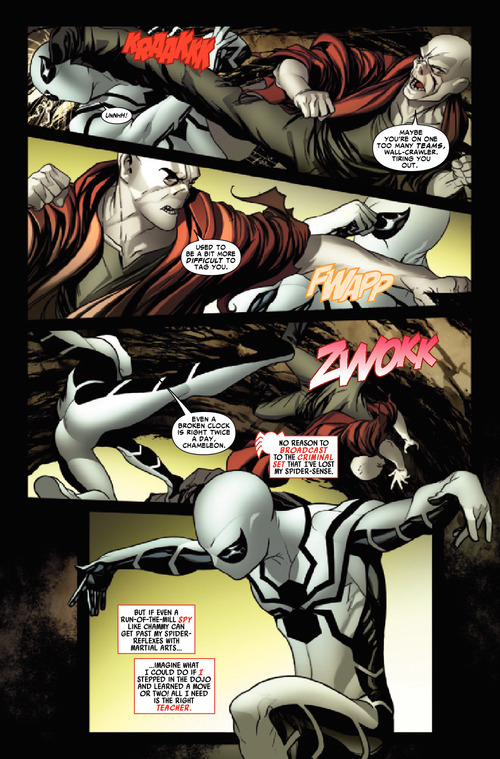
Beyond that, there were just other things that did not ring true about the dialogue. Chameleon pointing out to Spider-Man why he became so easy to hit was weird since he seemed to instantaneously know something was wrong with him. I know the dude’s a spy, but I have reason to believe that he couldn’t have twigged it THAT fast. Reason being that Spidey’s reflexes are 15x faster than a normal human being’s. Obviously the scene was done to ex posit that Spidey lost his Spider-Sense some issues back, but that still could have been done via thought caption without making Spidey look like a chump. Other examples like Sue Storm telling Electro that she’s the toughest member of the FF instead of showing him by just knocking him out felt forced. The talking security system felt forced (you’d think a security system would just respond to a threat w/o telling said threat that it was about to be assaulted for being a threat) and the full page splash of Spider-Man saving the kids, while awesome, came off as really heavy handed because there was no reason for Spidey to respond to Reed with the line “I’M STILL SPIDER-MAN! AND SAVIN’ PEOPLE IS WHAT I DO!”. Reed wasn’t even addressing him, he was talking to his wife. And Peter’s talking out loud to himself just seemed to be really cheesy.
 What it reminded me of was the notion that this comic isn’t being written for its storytelling. It’s being written to reiterate the fact that Spider-Man has become a specific brand that Marvel wants to get out there to the masses. That’s all well and good in theory, but it really does come at expense of the writing which seems so…so STAN LEE. And that isn’t a knock on Stan Lee’s writing, but it’s a comment on how the writing style feels very dated. By the 80s, this title had gone beyond that by and large, so to see the writing style go back to a more whimsical feel in my opinion makes the book come off as though it’s trying too hard to appeal to everybody. It’s not necessarily BAD, but it doesn’t work when compared to modern day Captain America, Thor, Iron Man, Daredevil or Hulk. Those books are being written with the tone of believability in their dialogue. ASM right now, to me, just isn’t.
The overall fight scene was entertaining however. I did like how Spidey and Sue took down Chameleon and Electro, I liked that Doctor Octopus was pulling a stunt behind the scenes, and I liked that Peter’s suit began to malfunction and switch costumes to the Jessica Drew Spider-Woman outfit and the original Kaine costume. Cool, fun concepts that were a treat to see.
Getting to the end of the main story with everyone’s favorite BND/Big Time target Carlie Cooper, we learn that although drunk as a skunk she balked at getting the Goblin tattoo and opted for a Spider-Man tattoo instead. Peter is amused/aroused by this, and the two definitely get it on by the end of the story.
Okay. A few things about this.
First off, the whole idea of Carlie seemingly getting drunk and going to get a Goblin tattoo was doomed from the start. It’s clear what Slott and Van Lente were going for with the typical girlfriend tension that, for some reason, has defined Spider-Man’s life more than his dedication to Uncle Ben and crime fighting. But this was never going to work for a list of reasons. The immediate dilemma was a two-way street into dead ends. If Carlie DID get the tattoo, not only would she have gotten a tattoo of a guy Peter hated, but she would have permanently marked on her body an image of the man who killed her childhood friend and Peter’s former fiancee, nearly took over Asgard and manipulated and impregnated her former roommate and that rommate’s fiancee. The idea presented in the last issue was that she wasn’t thinking at all, but it’s way too unrealistic to have the person who Mary Jane Watson herself said was someone “who knows that life is about more than herself.” be this idiotic. So that would’ve sucked, but now that she relented on it, it’s no more than a typical fake-out.
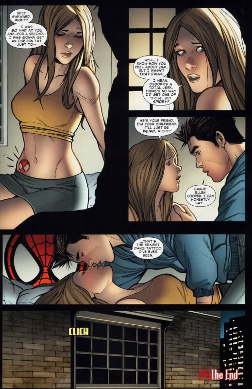
But the fact that she ended up getting a Spider-Man tattoo is just bizarre. Are we supposed to cheer for this? First of all, we’re going with the idea that she got the tattoo to spite Peter.
She got a Spider-Man tattoo to make Peter feel awkward.
I just don’t get it. Obviously she doesn’t know he’s Spider-Man, but that’s not going to tick Peter off if he wasn’t. Spider-Man is a typically divisive figure in the Marvel Universe, where half of NY hate him and the other half like him. She knows Peter likes him, so…why get the tattoo if she’s mad at him.
I really had to step back and think about this for a few minutes, because something is wrong with the way Carlie’s being written here. You can understand why Carlie’s upset with him, no matter how drastic she chose to get even with him lying about the “business trip” he took. But Peter just asks her to rely on her gut opinion about him. And she does and says he’s “good…and sweet…and kind…” I really have a problem with this because I do not buy for a minute that Carlie would go 180 on her concerns about Peter over the course of a millisecond. She said last issue how the people in her life had been lying to her in one way or another. If Carlie is truly the awesome gal the writers want her to seem, then she really needs to be more suspicious of Peter’s secretiveness instead of devolving to a simpering, diminutive woman who fears as though she “wrecked everything”.
I do not hate Carlie Cooper. I will fully admit that the cult of personality around her character, ESPECIALLY when Mary Jane is touting it is very annoying but that’s mostly due to lazy writing. It’s the method of TELLING, not SHOWING that gets under my skin. But the woman has been written pretty inconsistently in the past few months, and for a Spider-Man love interest you want more out of her. We know that she and Peter will have to break up eventually if for no other reason being that Spider-Man can’t get the girl. But if the writers want us to like Carlie and Peter’s relationship, they need to make it more believable and less conventional. Make it hard. Make it compelling. Don’t rely on worn out tropes like the…okay, the Spidey tattoo is a new one on me. BUT STILL, you see where I’m getting.
The two back up stories weren’t very memorable. I preferred the Jackal story over the Ghost Rider story because it was more to the point, but I didn’t understand why bullies wanted a kid to throw a test. Perhaps I missed something in the previous issue, but by the nature of this new gig that won’t happen again if I did. Didn’t care for the Jackal’s narration though. The Ghost Rider story definitely felt as though it were a Marvel Team Up story meant to big up Ghost Rider, mostly because it was.
Overall, I had a number of personal problems with this issue but nothing really struck out as offensively obnoxious. To sum up, the writing, while well intentioned, was lacking all over, but the art was very good throughout.
3/5 “MARY JAA”-no, that’s not it.
3/5 webs.
Hope this wasn’t too long and thank you for reading!


Looking over this issue, I thought it stank like an old fish. Carlie appears to be the 4th bead on Pete’s string. He’s going through girls like most guys go through old t-shirts. Use em and lose em.
Marvel has really cranked out some BAD stuff in the last 100 issues or so, and some of it makes me wonder if they are doing some bad boo.
This is really bad peyton place / soft R rated garbage.
Good review. Looking forward to more … just – change the blue color of PLOT and MY THOUGHTS. That blue on black is headache-inducing. 😉
Excellent job Donovan, looking forward to more of your reviews on this and the last ones of the 90’s show. Keep that SCIENCE goin.
Great review, Donovan! looking forward to reading more from you!
Don, you are now part of a great and enduring legacy. Best of luck.
And whatever the Brandnewverse Peter is, he’s not sexually frustrated.
Great review, Donovan. And good job of articulating why the whole Carlie Cooper tattoo subplot was the weakest aspect of this arc. BTW, credit for the “Many Faces of Carlie Cooper” image can go to ComicBooked.com, which is where I found it. 😉
Great review.
Summed up my thoughts I hadn’t been able to put into words yet. I read the issue and was so dissapointed in it. I don’t have any emotional link with the FF, and don’t want them to be guests in this book. We’re’s Jonah, Norah and other Spider-man characters?
I was ready to walk away from Spider-man for a few months, but I read the preview of the next issue and I was in stiches. It looks great. Chris Gage can write Spider-man any day for me. I got to the end of the preview and was annoyed the next page wasn’t there…and Spider-island sounds like it could be fun.
I thought the make of a great character was they were recognisable instantly, like the review pointed out, what does Carly look like? I like the idea of her, but they need a better writer on her
Good job on the review. Nice touches throughout and look forward to seeing your reviews in the future. I also want to pat myself on the back as well. For one of the first times in a long time, I actually predicted something correctly. As noted in the comments of ish #659:
“Of course, I am still not convinced she gets the GG tattoo. My bet, she gets a tattoo, but would not be surprised it is changed to something else, like perhaps even Spider-Man. Wow, think of all the hijiinks that would ensue…Peter would be jealous of his own tattoo!!! (Cue the laugh track…)”
OK, so Peter was not jealous of his own tatoo, but to help Don out, I think the joke here is the “irony” of Carlie getting a Spidey tatoo and Peter can’t tell her the truth…
Very good review. FYI, the bullies wanted that kid to skip the test because they thought the teacher graded on a curve, even though he apparently told them that she didn’t.
You did good, Don. You did good.
I am relieved that Carlie didn’t get the Osborn tattoo, and as for her and Peter getting it on…eh, they’re adults.
Dialogue did seem a bit stilted and forced, but then again, Slott is trying to emulate old-school Marvel comics, so I can forgive that.
Wonderful job Don, Great first review.
great review
Peter Parker prefers sex in the dark…interesting.
Why do you think they highlighted some of Spidey’s words in his narrative boxes in red… it reminds me of the old school Utlima game where they called out words that you needed to use to further the dialog when speaking to an NPC
Brian Wilson: “I feel like I wanna rage… right now”
http://www.youtube.com/watch?v=zZYJzsAXZX0
There’s a lot of rage going on at the boards because the fact that Carlie even entertained the idea of getting an Osborn tattoo makes her completely irredeemable and beyond redemption. I think the fact that she came to her senses and was up front with Peter about it shows that she genuinely cares about him. The fact that he forgave her shows that he’s serious about their relationship, so they have truly reached their next stage in their relationship (remember that at the beginning of the arc, the question was whether they were there yet).
I’m tired of being reminded spidey no longer has his spidey-sense every issue, it’s turning into the new “spidey runs out of web-fluid”.
Good well thought out review. Nice job.
Nice review. What the hell is Peter doing at the bottom of that one page? It looks like he’s posing for one of those 360 degree Matrix kick shots.
I like Caselli’s art, but the way he draws Pete out of costume just seems off to me for some reason.
@butters… lets wait to see how the next artist decides to draw her though
Brian Bradley I felt the same way when reading this issue. For all the problems Carlie brings, I can see why Peter is with her now 😉
Great review Donovan. I agree that Slott’s writing has felt “retro-Lee like” but I think that’s a good thing. It’s a breath of fresh air compared to BND and JMS before that.
Art’s surprisingly good.
Nice review. Welcome to Amazing, I’m looking forward to the fresh perspective.
All things being said about Carlie, her inconsistent look, and her tattoo aside… she’s uh, pretty hot in these pictures.