
 Our third book reviewed today, and that’s three in a row starring the dark and edgy sorts. I’m sensing a pattern in the modern Spidey family…
“Unconventional Warfare”
Writer: Daniel Way
Artist: Steve Dillon
Colors: Guru eFX
Letterer: VC’s Joe Sabino
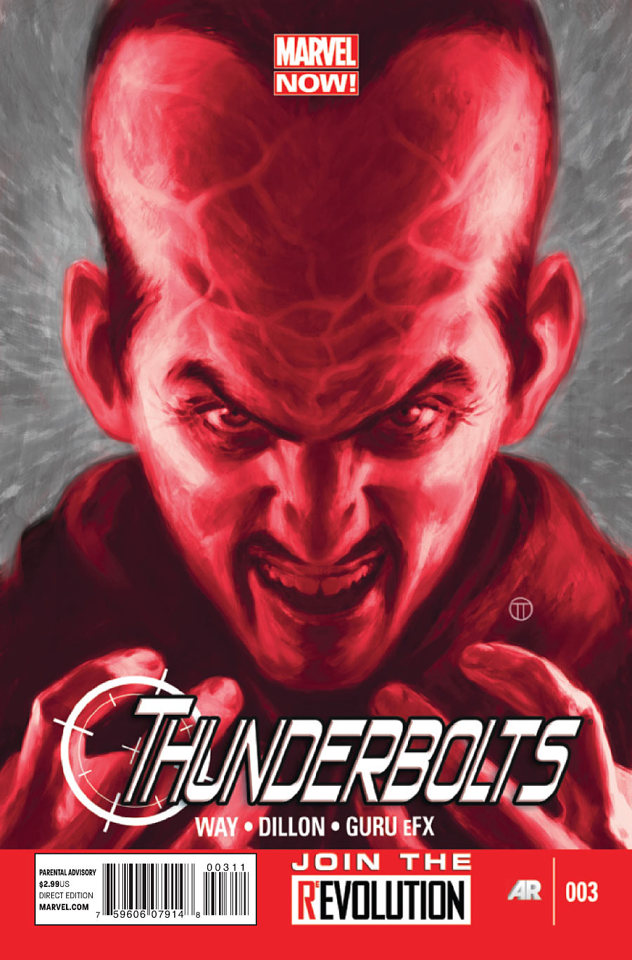
Cover: Julian Totino Tedesco
Variant Cover: Billy Tan
Editor: Jordan D. White
 THE STORY: Red Hulk explains to Deadpool that he depowered Samuel Sterns (formerly supervillain The Leader) and is now feeding him power on a very temporary and limited basis to get information he needs. Meanwhile, Punisher and Venom are helping the citizens of Kata Jaya fight General Awa, their dictator, and Elektra is in the hands of Sterns’ brother, Madman. When Red Hulk and Deadpool bring Sterns to Punisher and Venom, Venom objects and Punisher shoots Sterns in the head.
MY THOUGHTS: This book’s first issue showed real promise in my eyes, but the second issue became a confusing mess. As of this third issue, we have now hit a level that I can only describe as ten kinds of bland. Try as I might, there’s just nothing to really get into here.
And I’m at a loss for how you can even make this concept bland. We’ve got Red Hulk, Venom, Punisher, Deadpool, and Elektra teaming up to go take out some mofos. At very least this book should be fun, and at best it should be a violent opera of killers and villains. So for me to be entirely and irrevocably bored by issue 3 would be damn impressive if it wasn’t so infuriating.
 Not only are the story and the storytelling bland, but the art here is just as boring to look at. For the first two pages after the recap page, featuring the Punisher telling some soldiers to shoot a monkey, I was lamenting the relentlessly blue skies filling every panel as just a very wrong choice for the scene and the book in general, and very uninspiring to look at. I wanted some red in the panel somewhere to break it up and highlight the red skull on Punisher’s chest. Then we switched scenes and I remembered to be careful what I wished for. In this scene, we had Red Hulk and Deadpool (both characters who are predominantly red with just a splash of black) in a shipping container with backgrounds of solid red. I asked for a BIT of red, not panels that were nothing but. This made for an effect that was every bit as uninteresting as the blue, if not more so. And the whole issue continued pretty much in that way, with outdoor shots that were either too blue or entirely brown and indoor shots that were 99% red with a hint of black. The writing does nothing to carry you through the reading of this issue, so it really falls to the art to make your eye flow from panel to panel and page to page, and this art did the opposite. If the issue wasn’t so short and light on content I don’t think I would have even made it to the end.
This is also one of those issues that’s just a reviewer’s nightmare, because when nothing inspires any interest or thought, what is there really to say? I could sit here and call out each individual page and scene as bland, but let’s face it – we’re all tired of that word already, aren’t we? Even thinking back on it is just boring me. And really, that’s what makes a bland issue even worse than a truly bad issue. At least with an issue that is spectacularly awful there are things to talk about and it stokes your passions, even if in a bad way. But this issue? You begin to forget it the moment you’re done with it.
So why go on through a long review when I’ve already said all there is to say? This is a much shorter review than I typically like to put out, but frankly I have to rely on the issue I’m reviewing and this one just doesn’t support a longer review.
GRADE: 1.5 regrettable purchases out of 5. If I’m this bored, it can only get better from here, right? Right?


I for one said that this was going to suck back in September or October. Daniel Way is a terrible writer (he somehow thought Wolverine needed a son… Daken), Dillon’s style only fits normal looking characters like Preacher and the Punisher… not superhero characters like the Red Hulk, Elektra, Venom, and Deadpool (they look like there from King of the Hill) and most people agreed and thankfully… he’s leaving. But a new artist can’t makeup for the boring shitty writing that’s going on in Thunderbolts.
AJHammer… your too easily amused and your standers are way too low
I actually really enjoyed this issue. The back & forth between Red Hulk and Deadpool was really sharp. The delivery was smart.. Too many Marvel titles feel like they’re written for little boys and this feels like it’s written for adults. I love Way’s work so far. LOVE IT!
It’s Dillon’s art that can be a problem for me. His action panels are so flat and static. Soldiers being shot appear more like expressionless immobilized mannequins. But there will be an artist change at issue 7 at least!
I’ve not heard great things about Daniel Way for a while. I’m wondering what exactly this iteration of Thunderbolts was supposed to do for the MarvelNOW! line.
Really, I think Dan Way is a bad writer. His books are bland and are full of moments that try to be funny or make the characters appear bad-ass with a line to end the page off. Wolverine: Origins was only something of interest in the last 10 issues or so, everything before that was crap.
For I second there, judging by the cover, I thought Sinestro had joined the Red Lantern corps.
This is how I felt when writing that last Venom review in the issue about the U-Foes. There wasn’t anything to write about, and that made it so frustrating.
The art seems nice…