
Coming Soon got a nice scoop with a close up of Dan Dehan as the Green Goblin.

Coming Soon got a nice scoop with a close up of Dan Dehan as the Green Goblin.
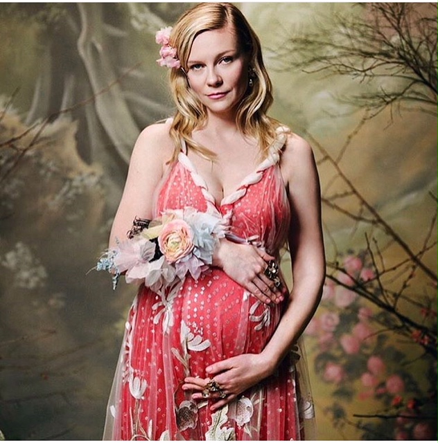
Actress Kirsten Dunst, who played Mary Jane in the Sam Raimi trilogy, is pregnant. She showed off her baby bump pictures in a new photo shoot for the Rodarte’ instagram page. Dunst 35 is engaged to […]
Trends International a poster company got trigger happy and has released some images from the Amazing Spider-Man movie. This is the first good close up look at the Lizard we’ve had. There is also a […]


Meh.
When I see this Goblin, I can’t help but think of this guy:
http://en.m.wikipedia.org/wiki/File:JekyllHyde1931.jpg
Not that it’s a bad thing or anything…he’s sort of a Mr. Hyde with a tech suit. And as far as I can tell, Norman Osborn has a lot of Mister Hyde in his character. If you get the chance to see the 1931 Rouben Mamoulian version of Doctor Jeckyll and Mister Hyde, you should…
I reallly like this redesign. The movie is supposed to be a more grounded approach (yes, even with all the crazy stuff it has), and as much as I will always love classic Green Goblin’s look, I understand that it wouldn’t exactly translate perfectly in the cinematic world.
I don’t have a problem with this.
#6 Pete won’t need to look at the logo, he only needs to look at his face. It’s clearly Harry Osborn with gel in his hair.
…Can we have the Rocket Racer or Power Ranger back, please?
I’m sure it’ll be a fine film; but I don’t like this look for the Goblin at all. It looks like Toad from X-Men with David Bowie’s hair and Iron Man armor. Also…why have the logo for your company on your alter ego’s costume? I suppose it won’t be a mystery to Peter, who the Goblin turns out to be…
Are you guys sure that’s Dane Dehaan? It could be Lady Gaga’s newest “Fashion” statement.
…waaaaitaminnit, isn’t that Toad from the first X-Men movie?…only worse?
Damn. Tried to re-word my post and I accidentally posted both versions, sorry guys.
His deformed face with the ear-pieces actually does kind of look like a flesh coloured Goblin mask. I actually think it looks alright.
His face with those earpieces kind of looks like a flesh coloured version of the Goblin mask, I actually kind of like it.