
 Which cover do you
 like better?
You might be interested in …
Mighty Spider-Man
Marvel.com sent me this promo image. It seems Spider-Man is part of the Mighty. Thoughts?
Marvel Vs Capcom 2 Coming to Xbox360 & PS3
It’s been called a classic of the last generation of consoles, but fans will now be able to play it on the PS3 and Xbox360. Marvel Vs Capcom 2 will be coming soon to the […]
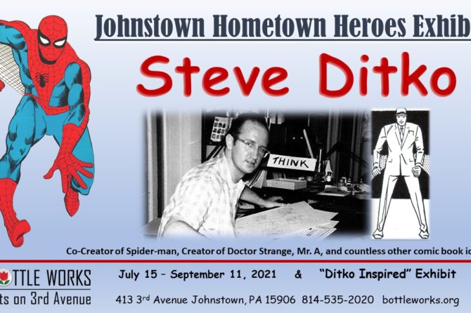
Steve Ditko Retrospective In His Hometown
Spider-Man’s Co-Creator is having a celebration this summer in his hometown of Johnstown, PA. Here is info on the celebration! The Crawlspace’s own contributor Bruce Wechtenhiser is also helping with the celebration. For Immediate Release […]
10 Comments
Leave a Reply
Support the Crawlspace on Patreon

Crawlspace Discord

Recent Comments
 on MARCO SPEAKS SPIDEY: Punisher vs. Spider-Man #1 Review: “The start of this issue is very annoying, as it deliberately tries to fool the reader into thinking the Punisher…” Jul 16, 09:34
- on Spider-Tracer: Boomerang’s 10 Best Costumes: “I was originally only planning to discuss three… and then I did some digging and found at least ten costumes!…” Jul 14, 16:56
- on Spider-Tracer: Boomerang’s 10 Best Costumes: “I was today years old when I learned that Boomerang had 10 different costumes over the years.” Jul 14, 06:00
- on Craig’s Critique: Amazing Spider-Man #31 (Legacy #995): “He Ain’t Heavy, He’s My Cousin” or “The First Rule About Super-Villain Fight Club Is …”: “@Quinn: Has there ever been an example of long-lost, never before heard of, friend or relative suddenly appearing and it…” Jul 1, 09:03
- on Craig’s Critique: Amazing Spider-Man #31 (Legacy #995): “He Ain’t Heavy, He’s My Cousin” or “The First Rule About Super-Villain Fight Club Is …”: “Hey, if nothing else May can win a huge lawsuit. The whole hospitals make mistakes is so lame. I can’t…” Jun 29, 23:45
- on Craig’s Critique: Amazing Spider-Man #31 (Legacy #995): “He Ain’t Heavy, He’s My Cousin” or “The First Rule About Super-Villain Fight Club Is …”: “@Dark Mark: “it is better than i thought it would end up being” That’s like saying a slap in the…” Jun 27, 08:09
- on Craig’s Critique: Amazing Spider-Man #31 (Legacy #995): “He Ain’t Heavy, He’s My Cousin” or “The First Rule About Super-Villain Fight Club Is …”: ““(Wait, this is the issue where May and Ben explain the birds and the bees to young Peter?)” Hahahaha! I…” Jun 26, 07:19
- on Craig’s Critique: Amazing Spider-Man #31 (Legacy #995): “He Ain’t Heavy, He’s My Cousin” or “The First Rule About Super-Villain Fight Club Is …”: “@Bruce, not Groos — Thank you for that! I didn’t realize it was a specific word, made up or not.…” Jun 22, 06:57
- on Craig’s Critique: Amazing Spider-Man #31 (Legacy #995): “He Ain’t Heavy, He’s My Cousin” or “The First Rule About Super-Villain Fight Club Is …”: “@evan berry @hornacek the word in the song was a made up word, “groos”, according to Jeff Lynne, the writer/singer…” Jun 21, 21:47
- on Craig’s Critique: Amazing Spider-Man #31 (Legacy #995): “He Ain’t Heavy, He’s My Cousin” or “The First Rule About Super-Villain Fight Club Is …”: “@Evan Berry: Unfortunately, until this issue I thought ELO was saying “Bruce!” I am fine with supervillains updating their look…” Jun 21, 13:48
I love the black and white rough sketch more than the final product, personally. There’s action going on in the final print, but Carnage looks more menacing and intimidating to Spidey. Plus, the background with the environment and different inanimate objects make both characters stand out much better in the pencil rough draft. Spider-Man’s perspective looks off in the final print when he’s supposed to be behind Carnage.
As others have stated on here I too prefer the published cover as it makes Carnage more threatening and stand out. The unpublished cover looks amazing but more suited to a splash page in that issue.
As others have stated on here I too prefer the published cover as it makes Carnage more threatening and stand out. T
Hey everyone – I agree that Marvel choose the correct cover.
I know this is way off topic, but I just tried to visit Sam Ruby’s old web site. It is totally gone! I know it has not been up dated for years, but it was still a great site to view covers and get educated on some Spidey history. I don’t know why the site was abandoned in the first place, but I will miss it. Does anyone know the story behind this?
I hope I am not out of line asking about this on the Crawl Space.
The rejected cover makes the reader think that he’s just another villain, as Spidey looks at him and say “Oh, another bad-guy.”
The published cover makes the reader think “Oh BLEEP, Spidey is helpless against this guy, and he’s not doing anything, just standing there while these tiny tendrils incapacitate Spidey!”
Both are good, but I think the final version makes for the better cover. The rejected art looks like it would be better suited as a splash page at the end of an issue.
Funnily enough I just framed and hung this issue on my wall! However, I do prefer the unpublished cover.
I’ve always loved the original #361 cover, as Bagley’s style splashes off the page. As a kid I’m like “WTH IS HE DOING TO SPIDER-MAN?!?!?!” The orginal cover’s a good cover, but it’s not as threatening as the printed version, an thus not as dynamic.
I prefer the published cover. The white background makes Spidey and Carnage stand out. Also, I like how Carnage’s head is drawn. I guess the round shape makes him look different to Venom?
I think the Carnage illustration on the unpublished cover looks better, but I like the more action oriented published cover. The unpublished one just looks like Spidey was interrupted from relaxing in a bunch of rubble.