

Our look at Spidey’s classic suit vs. his black symbiote outfit continues! Last time we discussed how the red costume worked better visually speaking. This time though we’re concentrating upon the man beneath the masks.
When Spider-Man first got his black costume in Marvel Super Heroes Secret Wars #8, it was explained that the costume responded to his thoughts and so modelled itself upon the new Julia Carpenter Spider Woman’s outfit, which Peter was apparently rather taken with.

However another school of thought I’ve seen argues that the symbiote was also influenced by Peter’s desire for the costume to reflect the image he now wanted as Spider-Man. Now he was no longer a teenager entering the entertainment business and had made a career out of crime fighting, he wanted a costume that would lead criminals and the public to take him more seriously, something more ‘mature’, something sleek, sexy and just plain ‘bad ass’.
It’s actually a fascinating idea and one I personally invest in.
It also helps to highlight exactly why the red costume is ultimately a better fit for him. Fundamentally Peter is not any of those things.
This is summed up rather nicely in a letter printed in ASM #305.
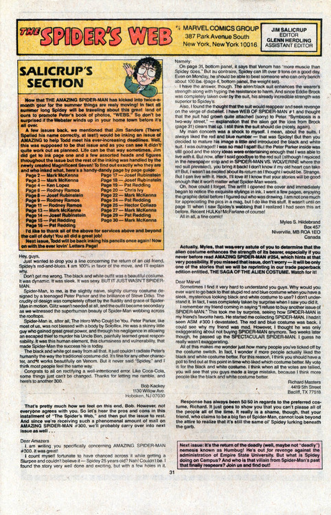
Hey, guys,
Just wanted to drop you a line concerning the return of an old friend, Spidey’s red-and-blues. I am 100% in favour of the move, and I’ll explain why.
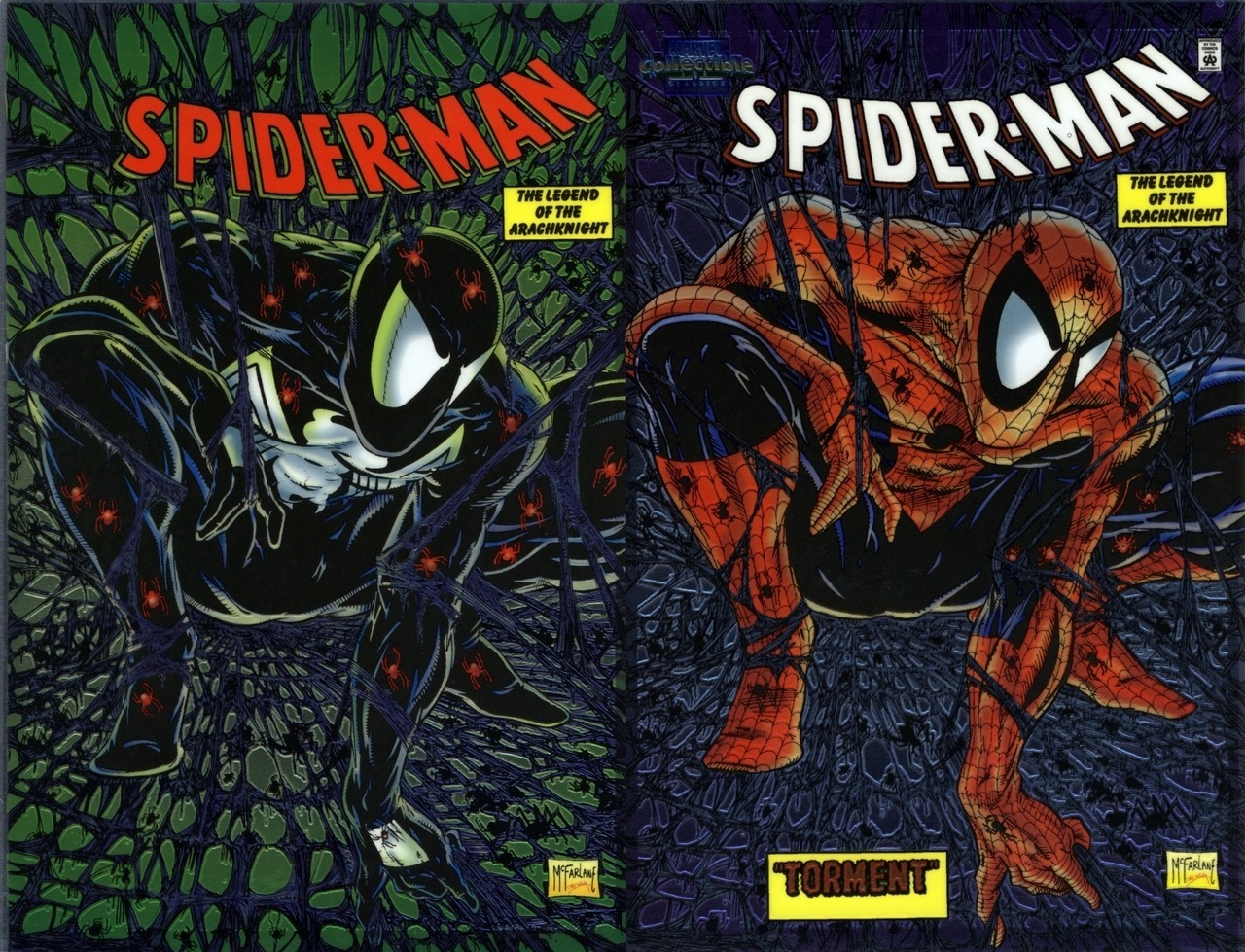
Don’t get me wrong. The black and white outfit was a beautiful costume. It was dynamic. It was sleek. It was sexy. BUT IT JUST WASN’T SPIDER-MAN.
Spider-Man, to me, is the slightly naive, slightly clumsy costume designed by a teenaged Peter Parker and the brilliance of Steve Ditko. The crudity of design was completely offset by the fluidity and grace of Spider-Man in motion. Glitz wasn’t needed at all, and the outfit became secondary as we witnessed the superhuman beauty of Spider-Man webbing across the rooftops.
Spider-Man is, after all, The Hero Who Could be You. Peter Parker, like most of us, was not blessed with a body of Soloflex. He was a skinny little guy who gained great great power, and through his negligence in allowing an escaped thief to murder his Uncle Ben, painfully learned great responsibility. It was this human element, this clumsiness and vulnerability, that made Spider-Man the success he is today.
The black and white got away from all that. It just couldn’t radiate Peter’s humanity the way the traditional costume did. It’s fine for any other character, and it works beautifully on Venom. But it never said “Spidey,” and I think most people feel the same way.
Congrats to all on rectifying a well-intentioned error. Like Coca-Cola, some things just can’t be changed. Thanks for letting me ramble, and here’s to another 300.
Bob Kackey
As Bob said, the red costume truly looks like something a dorky, awkward teenager who loved reading comics and science fiction would come up with and think was cool. Which is exactly what the costume was after all; though the idea that a teenager could physically create something like that so quickly is a stretch.
The design of the costume however reflects more than just Peter’s humble beginnings, it shines a light upon who he is deep down, which is rather different to the presumptions someone would make of the black clad Spider-Man.
Whilst the black costume’s design inherently carries an impression of intimidation, the bright colours of the classic suit gives off a more open, comical and friendly vibe. Of course, with the right artist the classic costume can also look intimidating. But that needs to be more consciously intended by an artist.
When drawn fairly neutrally the costume conveys friendliness and fun, which makes sense given how Peter designed it for mass entertainment on the wrestling circuit.
It is simply put a more positive looking outfit.
And deep down, in spite of the tragedies, guilt and anxieties he’s experienced, Peter Parker himself is ultimately a positive person too.
His sense of humour, often upbeat wryness and fundamental decency reveal him as such. He’d have to be a positive person at the end of the day to truly persevere in the face of all he has suffered.
To draw upon a cliché this is exactly why he really is ‘Your Friendly Neighbourhood Spider-Man’.
And the red costume does a better job of selling that, whereas the black outfit says less friendly neighbourhood and more ‘angry back alley’.
Which ultimately just isn’t Spider-Man; even if at times he wishes it was or wanted to project that image.
But you don’t have to just take my word for it. This view of the red costume in contrast to the black one can be observed in actual Spider-Man stories. But that’s a discussion for next time.


@Hornacek, I mentioned that up top.
Whenever someone talks about the red-and-blue costume being something that a teenager would design, it’s worth mentioning that a teenager designed this costume not as something he thought a super-hero would wear, but as someone in show-business would wear. Peter designed the costume without any thought of fighting crime – he wanted to go on TV and make money. So of course he would design a costume that would be bright and flashy and catch the viewer’s eye while he did amazing stunts to astonish people.