
Welcome back, Spidey fans! So, there I was, trying to figure out what I wanted to talk about with you guys this month, when I recalled an article that I really enjoyed, which was a look at Ben Reilly’s 10 best costumes. I thought about it for a bit, trying to figure out who would make the best subject matter, when I finally settled on Doctor Octopus! Doc Ock (as he’s often referred to), has had a wide variety of looks over his villainous career, both in the comics, film, cartoons, video games, etc. But for this article, I’ll be focusing on the main comics, so we won’t be discussing his appearances in other media (if we were, his 90s animated design and look from “No Way Home” would have both undoubtedly made the list). With all of that set, grab your sunglasses (or goggles, if you prefer!), and let’s take a look…
- Early 2000s
I really hate this costume. I hated the high collar, which, in a lot of cases, obscured his mouth (depending on who was drawing it). The all-black trench coat and long, black, greasy hair made Otto look like something more out of “The Matrix” than a Spider-Man comic. And what’s with the suckers on the tentacles? I never saw him use them to stick to walls (he doesn’t need to with those claws on the mechanical arms), but if anyone has, please, let me know. Otherwise, I don’t think they add anything to an already poor design. Some later interpretations gave this look a green version of the coat and shorter hair, but it did little to improve the overall look. Thankfully, Doc Ock has moved on from this look. So why was this one on the list? Ock wore it just long enough for this costume to be on several covers, receive a few figures, and, as a result, probably made it memorable for a few fans out there. So… you’re welcome, I guess.
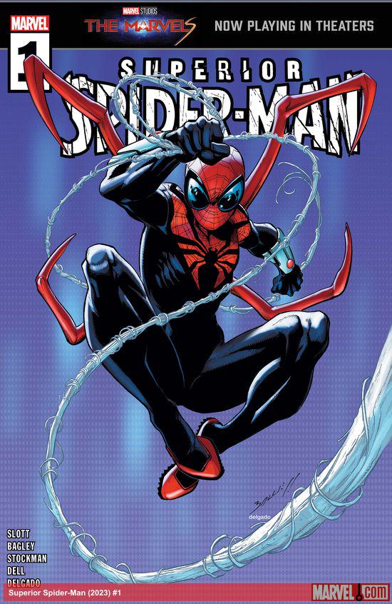
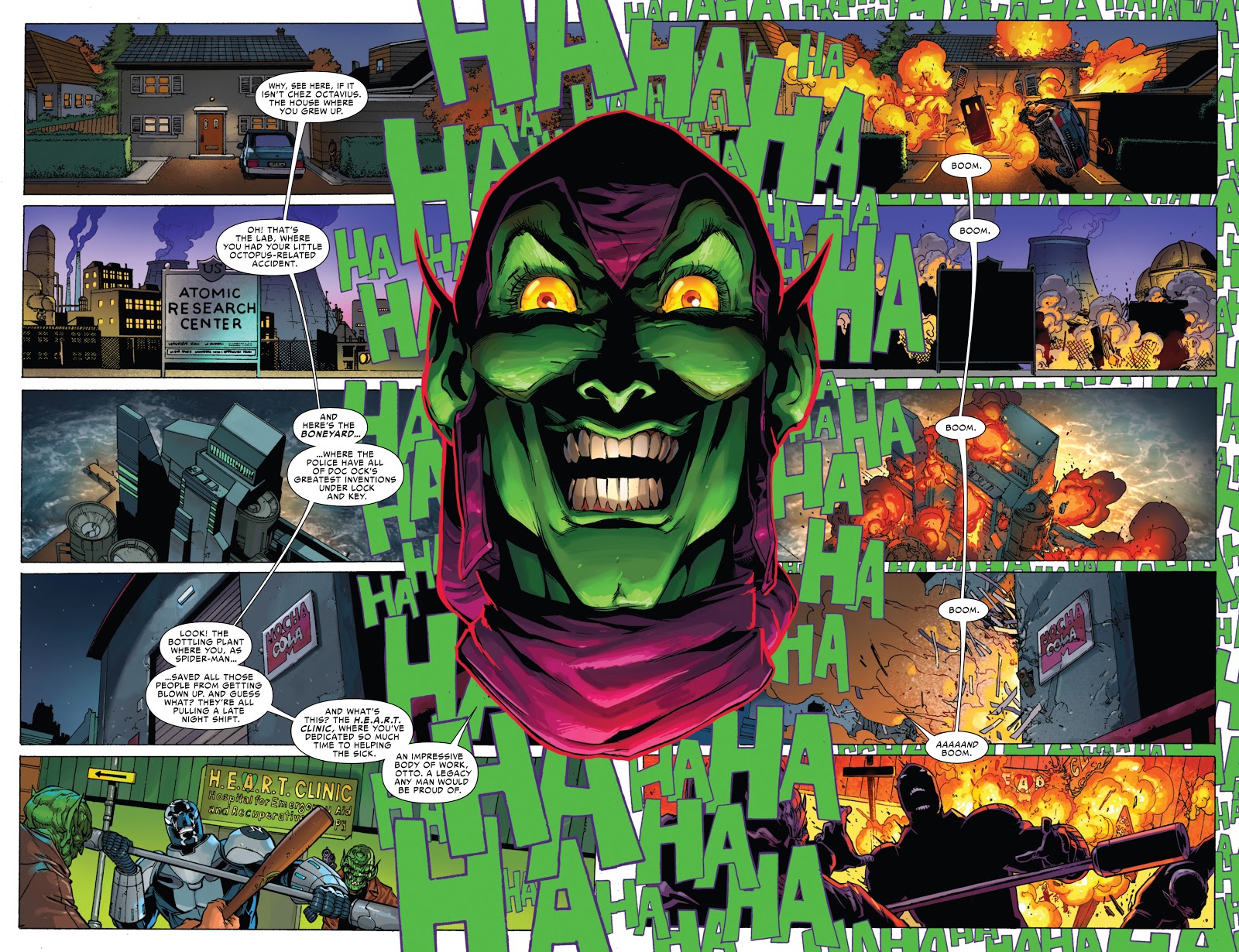
- Superior Spider-Man 1
![]()
After Doc Ock took over Spider-Man’s body and identity, he redesigned the classic costume. Aside from the goggle-like lenses, not much here really shows Otto putting his stamp on this design. I never understood the weird toes he gave himself. It’s not a bad overall design by any means, but as for as looks for Doc Ock, it’s not one of his best, and he did a much better job with designing a Spider-Man costume later on.
- Dying

This one’s creepy, no? With his body failing him after taking too many blows to the head over the years, Doc Ock added two extra sets of tentacles to compensate for the loss of his actual bodily limbs. I don’t really understand the lights on here, but otherwise, it’s an okay design that fit the story.
- “Ends of the Earth”

Still dying, Doc Ock decided to reinforce his dying body by adding a protective bodily shell. He also gave the eight tentacles giant clamps and added some “Bane” tubes. The lights were still present from the previous costume, but made more sense coming from a robotic shell. I feel like the suit needed a clear plastic shell over the face to protect him a little better (he was dying from blows to the head, after all!), but overall, this design trades in some of the creepy factor for a more menacing, powerful look; a look I enjoyed much more than the previous “dying” design.
- “Chapter One”

In the late 90s, Marvel went with writer/artist John Byrne’s vision for a rebooted Spider-Man. It was less than well-received. Not only did the backstories change for several of the villains, but so did some of their costumes. Doc Ock’s was… a weird one. I don’t get the metal leg and glove coverings. Perhaps Byrne wanted to have his actual appendages match the tentacles in a way? Perhaps they acted as braces following the explosion that gave him (and Peter Parker!) his powers? The all-white tunic-y design element did nothing to make this design more memorable, either. When the PS1 Spider-Man video game came out, it used several villain design elements from the Byrne reboot, and while it did use several elements of the Byrne design, it was given a more classic Doc Ock color scheme, which worked much, much better. While certainly not the best look by any means, at least this was noticeably, without a doubt, Doctor Octopus, unlike the previous few designs. There were versions of this look where the white was substituted with green, which I decided to show here, as it makes for a noticeable improvement. Also, it seems that in more recent years, the whole “Chapter One” story was made into an alternate universe, and, while I said I wouldn’t be covering those looks, this was, for all intents and purposes, made to be the main continuity when it came out, and this Doc Ock design did find itself in several issues of the main Spidey books at the time, hence its inclusion.
- Superior Octopus

Doc Ock came up with this number after his first stint as the Superior Spider-Man, but before becoming Doc Ock again. He was also utilizing a cloned Peter Parker body following “The Clone Conspiracy”. I like the goggles less here than with his Superior Spider-Man costume, but he does have the tentacles back! The design of the rest of the costume isn’t bad, but it just doesn’t scream Doc Ock to me.
- Casual
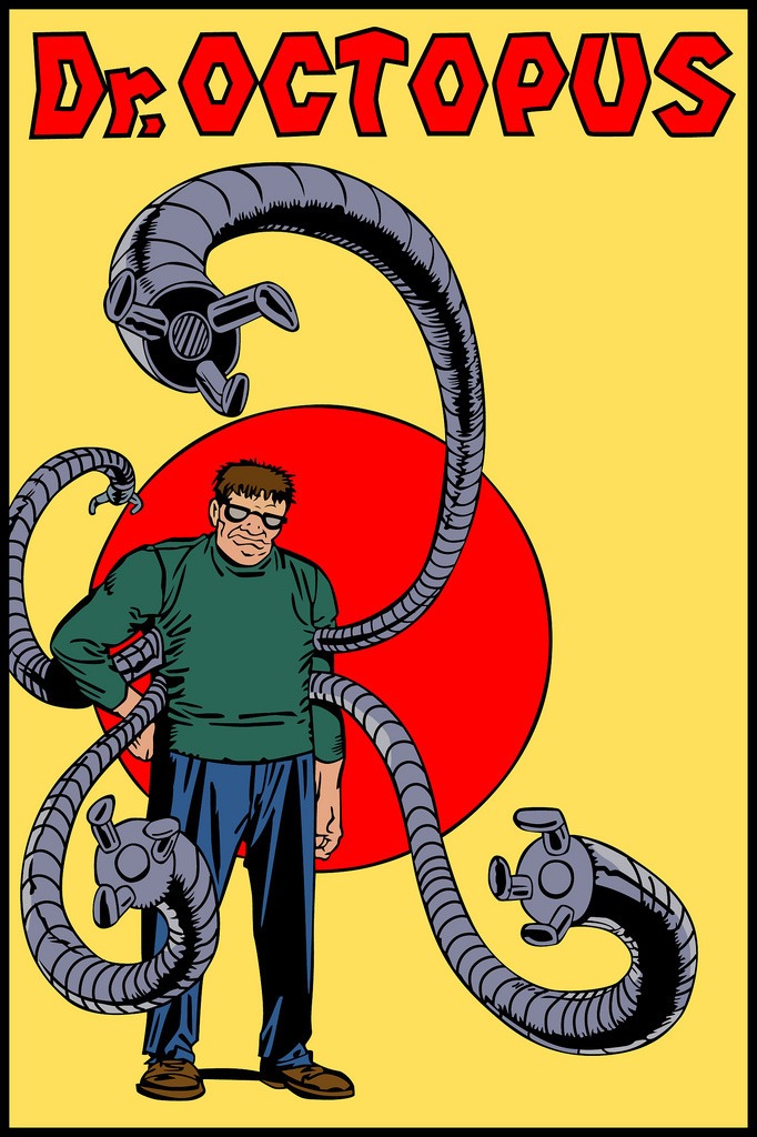
Sometimes, Otto doesn’t have time to put his classic costume on, or the white Armani suit is at the dry cleaners. Or it’s just casual Friday, and Otto throws a number like this on. Either way, co-creator Steve Ditko made this design work nicely for ol’ Ock, and while it’s been seldomly used since, it’s one I rather enjoyed!
- Superior Spider-Man 2
This Spider-Man costume was a much better design choice for Otto. Gone were the toes, and back were four extra metal appendages, though they did lack the “claws” on the end of them. With what appeared to be influence from the unused movie Spider-Man design by Alex Ross, Doc Ock kept the goggles from his previous Spidey costume, and gave this costume a less symmetrical pattern of webbing and black, further signifying that this was a much darker Spider-Man than most people were used to.
- White Armani Suit

This is probably my second favorite Doc Ock look. In an early Doc Ock design by Steve Ditko, the character was clad in all white, which this look might have been a throwback to. This design helped let you know that he was intelligent, but not afraid to get down to business (which usually included trying to kill Spider-Man and/or taking over the world!). Doc Ock also wore several color variations of this suit (probably to prove he had more than one suit in his closet, which was the right move), but the white was probably the most striking and memorable. In fact, it’s a look that Otto returned to not so long ago!
- Classic Green and Orange Jumpsuit

When I think of Doc Ock, this is the look I first think of, making it, of course, my favorite look in the lineup! This costume, in a sense, reminds me of a radiation suit, complete with its bright coloring choices, boots, and gloves, which is perfect for a former leading nuclear physicist! Add in the glasses or goggles, depending on the artist, and you have one of the most memorable designs in Spidey’s rogues gallery. This look is so popular that Ock has worn several variations of it, including simple color palette swaps.
Which of Doc Ock’s designs is your favorite? Did yours make the list? Let me know in the comments section below!


What about that brief period around 1985 where he wore a white lab coat and huge green safety goggles? Circa early issues of Web of Spider-man #5…
I love the Armani suit Ock. I still remember when the panel was reviewing the Superior SM issue where Stunner returned and SpOck used a hologram of himself to talk to Stunner, and it was how he looked in the Armani suit, and Donovan said “And Doc Ock is in his white Armani suit straight out of the 90s and it’s glorious!”
The orange and green suit is originaly a wetsuit and I never understood why Romita made him wearing it after as the wetsuit was needed because his master planner’s HQ was underwater (and all his men wore wetsuit too), but after the wetsuit was not needed for fighting Spider-man.