
 Sony has released a second image from the new movie and also settled on a name. What do you think?
You might be interested in …
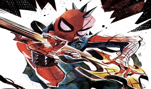
Spider-Variants of the Week 4/6/22
Will You Be Picking Up A Variant This Week? And don’t forget to check out the previews for this week’s releases as well Devil’s Reign #6Spider-Punk #1Black Widow #15 DEVIL’S REIGN #6 CRAWLSPACE PREVIEW STORY […]
Weird Marvel Collectable #119
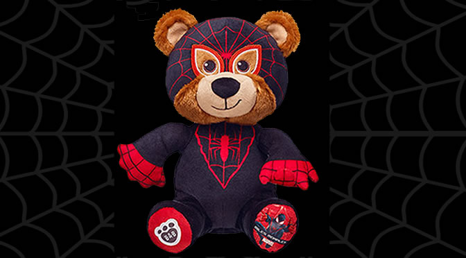
Build-a-Bear now has a Miles Morales Bear. It isn’t customizable and comes pre-stuffed, but hey, it’s a Miles Morales bear. I wonder if it has a little electric shock in the hands to mimic the […]
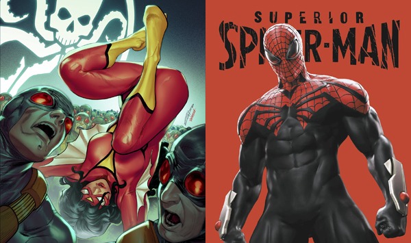
Spider-Variants of the Week 1/24/24
What Variant Will You Be Picking Up This Week? CRAWLSPACE PREVIEWS
40 Comments
Leave a Reply
Support the Crawlspace on Patreon

Crawlspace Discord

Recent Comments
 on Marvel Comics is Moving to California; Stephen Wacker Becomes EIC: “Uh-oh. I began listening to the Crawlspace shortly before Wacker began editing the Spider-Man books with that combative style, and…” Jul 18, 15:50
- on Marvel Comics is Moving to California; Stephen Wacker Becomes EIC: “This might be a good time for the Crawlspace to repost the earlier interviews with Wacker.” Jul 16, 15:34
- on MARCO SPEAKS SPIDEY: Punisher vs. Spider-Man #1 Review: “The start of this issue is very annoying, as it deliberately tries to fool the reader into thinking the Punisher…” Jul 16, 09:34
- on Spider-Tracer: Boomerang’s 10 Best Costumes: “I was originally only planning to discuss three… and then I did some digging and found at least ten costumes!…” Jul 14, 16:56
- on Spider-Tracer: Boomerang’s 10 Best Costumes: “I was today years old when I learned that Boomerang had 10 different costumes over the years.” Jul 14, 06:00
- on Craig’s Critique: Amazing Spider-Man #31 (Legacy #995): “He Ain’t Heavy, He’s My Cousin” or “The First Rule About Super-Villain Fight Club Is …”: “@Quinn: Has there ever been an example of long-lost, never before heard of, friend or relative suddenly appearing and it…” Jul 1, 09:03
- on Craig’s Critique: Amazing Spider-Man #31 (Legacy #995): “He Ain’t Heavy, He’s My Cousin” or “The First Rule About Super-Villain Fight Club Is …”: “Hey, if nothing else May can win a huge lawsuit. The whole hospitals make mistakes is so lame. I can’t…” Jun 29, 23:45
- on Craig’s Critique: Amazing Spider-Man #31 (Legacy #995): “He Ain’t Heavy, He’s My Cousin” or “The First Rule About Super-Villain Fight Club Is …”: “@Dark Mark: “it is better than i thought it would end up being” That’s like saying a slap in the…” Jun 27, 08:09
- on Craig’s Critique: Amazing Spider-Man #31 (Legacy #995): “He Ain’t Heavy, He’s My Cousin” or “The First Rule About Super-Villain Fight Club Is …”: ““(Wait, this is the issue where May and Ben explain the birds and the bees to young Peter?)” Hahahaha! I…” Jun 26, 07:19
- on Craig’s Critique: Amazing Spider-Man #31 (Legacy #995): “He Ain’t Heavy, He’s My Cousin” or “The First Rule About Super-Villain Fight Club Is …”: “@Bruce, not Groos — Thank you for that! I didn’t realize it was a specific word, made up or not.…” Jun 22, 06:57
this movie looks promosing… however even after looking at iron man 2, and the previews for thor and captain america…
marvel movies look better… but still fall short of movies worth watching again..
as long as they get bums on the seats though… aint gonna win no awards.
Ooops…..I missed a word in between “like” and “should”. Insert an “it” there. See? The very thought of this suit causes typing errors.
This costume is the ugliest thing since J. Jonah Jameson. If a ’70s show like The Electric Company could make Spidey’s suit look like should, you’d think Hollywood in 2011 could make it work.
@#17/#35
Great minds think alike. That was the first thing that struck me when I saw this.
I will admit that the picture DOES look cool. However, it doesn’t change the fact that I know what the full suit looks like (Silver Shoes and Codpiece included). So this pic is nothing more than false hope. Nice looking, but I still know what lurks in the shadows of that costume: Bowie Crotch.
That…
looks like the spiderben/ spidergirl(mayday) costume
hmm
best pciture of the suit I´ve seen so far. But yeah, it kinda sucks that it´s just squares instead of a web pattern. And why name it Amazing if the plot is from Ultimate? I mean sure, it´s a good title, but it´s also kinda weird.
The official website for the movie is up. Anyone going to register?
http://www.theamazingspiderman-movie.com/
This looks great!
Everything I see gets me more and more excited.
The only thing I’m unsure of is the retelling of the origin, because think anyone whose going to see it doesn’t know. They don’t retell Bond’s origin every three films. But it looks great!
Still don’t like the costume….
Looks better in this shot, now if only they’ll hide the waist, feet and the line running down his legs through the entire movie. Bad thing is, I’m noticed that the “webbing” on the red parts of the suit are not actually webbing but squares.
If they changed the patterns at the back of the legs and the gloves and removed the weird lines going around the legs and the elbow area, I would be fine with the suit.
It’s a good compromise of “classic” mixed with a few minor tinkers that make it stand alone for the movie. Web shooters look sweet.
Meh, looks like the Ben Riley Spidey costume. I notice they have blocked out the waist and feet.
I like that image!
@24
I concur that costume does look pretty cool.
That costume looks pretty cool. What’s wrong with you people? (I say that with much love, but seriously guys, it’s not crap).
Great name, but that costume still looks like CRAAAAAAAAAAAPPPPPPPPPPPPPPPPPPPPPPPP.
I don’t think its fair to bring up that the silver footies or the blackened crotch in reference to this picture, since it seemed pretty apparent that those were just for on set production, or a result of too much head-humping. Once the camera and the lighting work has been done these are the more likely pictures we’ll be seeing. Like many have said, it doesn’t make up for the front-less belt or the weird design of the stripes down the arms and legs, but I’m really anxious to see how this looks in the trailer, whenever we’re lucky enough to see that.
Looks better here. Still not as pretty as the Raimi suit but I can deal with this. 🙂
I imagine if this picture was the very first image of the suit to be released, the fan reaction would have been a lot more positive. It would have just delayed the inevitable backlash, but still. Anyway, I can’t unsee the “belt”-less waist, the silly red stripes down the legs, and those what-the-heck silver footsies from the on-set pictures, all of which are conveniently covered and hidden in this image. Those are still my biggest problems with the suit, and unless Spidey is going to be running around in that exact pose and lighting for the entire movie, all that tinkering to the suit is still awful. Yeesh, even the web pattern sucks…look at the boots! I’ll still check out the movie, but they better do one hell of a job with the story, acting and special effects, because that’s what its got to take for me to get over this lousy and needless redesign of the suit.
Man, that suit is the only thing keeping that from being a great photo.
Okay, calling the new film “The Amazing Spider-Man” was definitely an appropriate and good idea. As for the costume, again, I like the coloring and the texture of the suit, and I think the best part of the costume is actually the mask–because that’s the few things about the suit which still is faithful to the original. Again, just because one can do a little alterations to the lighting and color saturation to make something look better, it still doesn’t change the fact the filmmakers unnecessary alterations to the pattern of the costume just for the sake of it. And notice how carefully hidden the half-belt, the piping running down the legs, the silver-spur like things on his boots, and especially the blackened crotch-piece are in this pic.
Kind of reminds me of Ben Reilly’s suit.
It would look better if they didn’t screw up the costume.
Im likin the title. and the actress playing Gwen. I like her a lot 😉
Well, the story better amazes me, along with everything else
Woo that’s pretty bad ass!
@Stuart…. its only 9 bucks for a movie around you? im jealous, I’m lucky if I get that price for a matinee in Northern Virginia
His hands are patterned to look like the fingerless gloves we’ve seen him wear in pictures of his civilian persona. I just noticed that.
This new Spider-Man suit looks just as bad as ever. And I don’t like how they clearly reveal the black diamond-like spots on the gloves where Spider-Man needs to tap his fingers in order to shoot his webs. It makes the gloves look even worse. Sure, the webs look raised a bit more and look a bit better in this photo than past pics, but I’m still not going to shell out $9 at my local cinema to see this. Thanks, but no thanks.
Web-Shooters!!!!
If they just got rid of those stupid red streaks on his arm, fixed the gloves, and gave him his belt that suit would be perfect. It would look less “Hollywood” than the Raimi suit but that would make it better. I still love the Raimi suit btw, I’m just sayin.
That image looks pretty sweet…..still don’t care for the gloves, but oh well, everything else looks solid and I’m glad they went with Amazing Spider-man for the title!
I LOVE this image, and the title. Very excited by this.
best thing about this picture: you don’t see the effing shoes!
Looks awesome!!!!
Nice classic name, this bothers me for two reasons though… 1) if they are saying the story for this movie will be more like the Ultimate storyline, why use the Amazing Spider-Man title… and 2) if Marvel ever does get the rights back to this movie, this probably means that they can’t call their movie Amazing Spider-Man, which sucks..
not sure if I’m a fan of that pose in the picture either
My faith in this movie is slowly crawling back (pun not intended.)
Looks more like Spider-Man 2099 than Spider-Man. Meh.