
 Spider-Man’s a character introduced in a visual medium, so it’s important sometimes to consider the art. This is a character that has had runs by some of the best artists in the comics industry: Steve Ditko, the John Romitas, Ross Andru, Gil Kane, John Byrne, Marcos Martin, etc. And then there are prominent artists, who had briefer stints: the likes of Alex Ross, Steve McNiven, Darwyn Cooke, Bill Sienkiewicz, Eduardo Risso, etc.
These artists had a variety of styles, although it mainly falls into several categories, each of which has a different effect on the reader and the storytelling.
I’ve been able to come up with four main types of Spider-Man artists, although there are two categories that are more popular than the others. I call these Dynamic and Street-Level.
DYNAMIC
I’d almost say this is the standard superhero art format. The people whose adventures are depicted are generally handsome and attractive, while the fight scenes are usually bright and intense. John Romita Sr, Mike Wieringo and Mark Bagley would belong in this camp. They draw Spider-Man as a science hero, doing amazing things while fighting individuals with visually impressive abilities.
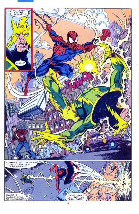
You could imagine the dynamic artist doing very well on a standard Superman book. Case in point: Ross Andru’s work in the Superman/ Spider-Man crossover.


STREET-LEVEL
The second kind of Spider-Man artist is Street-Level. These are the guys who seem to be a better fit for drawing Batman than Superman. There’s a more down-to-earth quality, even in the superhero slugfests, and a disproportionately high number of scenes are set at night with characters obscured by shadows.
The bad guys are often going to be the types who can exist in the real world: mafia goons, carjackers, crazed gunmen with ski masks and shotguns, etc. The artwork could often be just as powerful in black and white. 21st Century John Romita Jr. and Lee Weeks would fit in this group of pencillers.


DITKOESQUE
The next classification of Spider-Man artists would be Ditkoesque. I use that term because I’m having trouble coming up with a better name for the approach of Steve Ditko and those he influenced. There’s a clean almost cartoony style, although the layouts and perspectives could be quite unconventional. Even with the unusual techniques, storytelling remains paramount, so that the reader doesn’t need to read the text in order to follow what’s going on. Examples of those following in Ditko’s footsteps would include Marcos Martin, Mike Allred and Javier Pulido.
One interesting thing about the Spider-Man comics is that the first artist wasn’t in the traditional dynamic category. Ditko was in a class of all of his own. Of course, it’s worth remembering that Amazing Spider-Man became Marvel’s best-selling title under John Romita Sr. When Ditko was on the book, it was outsold by Lee and Kirby’s Fantastic Four. That’s obviously nothing to be ashamed of, but it suggests that the traditional will be more popular than the off-beat, even if the off-beat was part of the series in the very beginning.


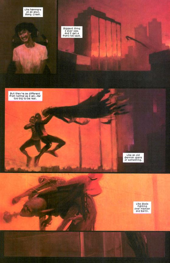
WEIRD
The final art category would be Weird. In this case, clarity of storytelling isn’t as important as conveying a particular mood. Usually it’s a horror-inspired tone, with the oddity of the pencils reflecting the strangeness of what’s going on with the characters. These pencillers are more likely to do side-projects—mini-series with particularly experimental editors, or stories in anthology titles like Ultimate Marvel Team-Up or Tangled Web—than to draw Amazing Spider-Man, although that was a feature of the Brand New Day era. Chris Bachalo, Brendan McCarthy and Ted McKeever would fit into this category, which arguably includes Todd Mcfarlane’s solo work on the adjectiveless Spider-Man. Another phrase for these types of artists would be “highly stylized.”

FINAL NOTES
Some people are going to have preferences for one style over another, and that’s perfectly appropriate. Likewise, you might have preferences for a particular approach when it comes to street-level comics or whatever, and that’s also fine. By figuring out the styles, it gives a sense of what the artist is trying to do, and how something that may appear to be a mistake—exaggerated features, unusually low or high number of splash pages, etc.—can be the result of a conscious decision, even if you don’t care for what they were trying to do.
A few Spider-Man pencillers could fit into several of these categories, especially at different points of their careers. Ramos seems to be more of a dynamic artist when he’s on Amazing Spier-Man, although he was much more comfortable as a weird artist when he worked with Paul Jenkins.
There are some other categories, but some are a bit more obscure, usually occurring when someone with a distinctive voice is asked to bring that style to the Spider-Man comics. Darwyn Cooke’s two issues of Tangled Web fit a cartoony fashion reminiscent of a Disney/ Warner Brothers form of animation. Peter Bagge did a one-shot in his alternative comics approach.
The groupings are subject to change. If a lot of artists start working in a particular style, that is likely to become its own category. If we start getting more manga-influenced Spider-Man comics, or hundreds of issues with a graffiti-influenced hip hop style, these could become major types of Spider-Man art.
The question of artistic styles has been complicated by the schedule of AMAZING SPIDER-MAN in the last few years. 2007 was the last time there was one consistent artist on the title; Otherwise, it’s been a rotating team with occasional one-offs. This does raise a lot of questions for the people in charge, as well as Spider-Man fans. Presumably, we all want competent artists. And we don’t want rush jobs with multiple artists on the same issue. But, how much does it matter if the main stories in a trade paperback are in the same “style?” Would it bother you if a trade paperback has a two issue storyline by Adi Granov, followed by three issues by Giuseppe Camuncoli and a single issue by Eric Canete? If you prefer that the series generally have one “house” style, what type of exceptions would you allow?
I’ll admit that having a consistent style isn’t a priority for me. I could understand trying to preserve artistic consistency on the book if Amazing Spider-Man were just one of several monthly titles. But at the moment, it seems like too restrictive an approach for a character that can work in so many different methods. Your mileage may vary.
What do you guys think of these divisions? Would you group the artists differently? Do you have better names for the styles?


I learned a new trick, so formatting should be fixed. It’s now smartphone friendly.
I would also like to add that I always saw Alex Sauvik as a mix between Dynamic and Street-Level, and I think that worked well for the stories on Web that were a mix of Street Level crime dramas that had a few superhuman things sprinkled in.
I’m having the same problem as #3 in layout of the article. I’m using Firefox on my computer.
To me I think the best all round Spider-Man artist is Ron Frenz. You could say other people draw the most iconic Peter Parker, Spider-Man, MJ, Kingpin, Venom, Green Goblin, etc. But with Frenz he has a style which allows him to draw all the major characters and make them look distinctive and emphasizes their iconic features. E.g. if he drew a group of green eyed red headed women in plain street clothes you’d be able to tell clearly which one was Mary Jane, Jean Grey, Siryn, Lana Lang, etc.
At the same time he does wonderful backgrounds and knows how to make a story flow with the panels and maximize the space he has on a page.
For me, I can get around any of the art styles as long as I can recognize what is going on. There were some artists during the Gauntlet that were so awful that I couldn’t even figure out who was Peter Parker until somebody mentioned him by name. Erik Larsen’s art almost made me leave the title. I really had a hard time getting through his work. I know a lot of people think he is great, but it just doesn’t work for me. Hey, I don’t know art. I just like what I like and don’t what I don’t. I really liked McFarlane’s art at the time, but looking back on it it’s just O.K.
I like both of the Romitas. When I think of Spider-Man, my first thought goes to John Romita Sr. and his work in the ’70s.
@#3- Formatting in WordPress is a pain in the rear. It will show it one way in the editor, but not present it that way on the actual front page. You can forget centering pictures. On top of that, it reformats the text to screen size and resolution. It gives us much frustration. I think that is why the reviewers often use only a few pics. You end up with pictures not where you want them in the text or you end up with a lot of blank space.
Thanks for the responses.
@#1: I hadn’t really considered it that way, but “stylized vs natural and detailed vs minimalist” is another way to look at the sorting of artists, and gets the same results.
@#3: It’s not intentional on my part. Formatting’s certainly weird. It looks mostly fine on Chrome on my computer, but it doesn’t work as well on my tablet. I don’t think I can reconcile this.
Mets, not to be rude but I am looking at this article on google chrome and I don’t know if this was intentional on your part but it is quite hard to follow. The text and pictures seem to be a bit muddled as the text mid paragraph/sentence gets interrupted by images and when you move on to discuss a different style of artist images of the ones from the previous one are front and centre amidst the text. E.g. I’m reading about weird artists and the paragraph is side by side with a Romita Junior picture which is stacked on top of a Ditko page. Then in the final notes section you have Bachalo whom you mentioned in context of the ‘weird’ artists section.
As for trades are nothing more than the DVD boxsets of comics. If a trade contains 2 3 part stories or 6 1 part stories all that matters is the quality of the stories in question. Art styles don’t bother me too much although obviously for one particular story I’d want a uniform style. I wouldn’t want a 6 parter with six different artists unless that was the point (e.g. you jump to different worlds or time periods). But if I had a six issue trade with six one shot stories I wouldn’t mind if they each had a different artist though I’d prefer consistency.
That being said comics being a collaborative medium I think having a consistent artist helps the writer out a lot. If they know what a certain artist can do they can begin writing to their strengths and build up a great relationship with which to bounce ideas back and forth. It’s like if a TV writer constantly had their lead character being performed by rotating actors. The final product could be written in a way which would allow for anyone to pick it up and get going but it wouldn’t be as strong with just one person going on consistently.
Whilst Romita Junior does fit into the street level stuff I would say he works very well for the dynamic stuff too. Bagley does to an extent as well but I agree with your assessment of where their strengths lean towards. But I think Romita Junior back in the day is very balanced. He can do street thug mafia stories (see his 90s Jimmy Six stuff). He can do weird horror/mystical stories (see the Shathra stuff). He can do touching emotional stories (see ASM vol 2 #38 and #50) and he can do big action spectacle stories (see ASM #500, PPSM #75 and all his 80s stuff.
My own personal favourite Spider-Man artists go
Romita Junior/Bagley (my top 2 and eveyone else fluctuates)
Ron Frenz
The Dodsons
Alex Saviuk
Mike Wieringo
Sal Buscema
Romita Senior
Todd McFarlane
Paolo Rivera and Marcos Martin are my absolute favourite modern day Spider-Man artists. I wish they did more Spider-Man or were given a run on the title.
I’d say that it’s a matter of stylized vs natural and detailed vs minimalist. Going with your labels,
Dynamic – Stylized and minimalist
Street-level – Natural and detailed
Ditkoesque – Natural and minimalist
Weird – Stylized and detailed
My top five Spidey artists are Ron Frenz, Paolo Rivera, Mark Bagley, J. Scott Campbell and John Romita Sr. I guess that means my preference leans more towards dynamic and street-level.
Inconsistencies in art bother me when it’s in the middle of a story arc. If it’s month-to-month, reading ASM for…wow 8 years now, has primed me to be ready for something different each time.